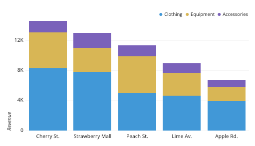
Introduction to Stacked Column Charts
Data visualization can transform complex information into a story that anyone can understand. Among the many tools available, stacked column charts stand out for their ability to display data in a clear and visually appealing way. These charts break down information by stacking different categories on top of one another, allowing you to see not only individual contributions but also the total at a glance.
Whether you’re analyzing sales figures, survey results, or project timelines, stacked column charts offer an intuitive way to present your findings. They allow viewers to grasp trends quickly while showcasing relationships among various segments of data. If you’ve ever felt overwhelmed by raw numbers or static tables, it’s time to explore how stacked column charts can breathe life into your presentations and reports.
Get ready as we dive deeper into everything you need to know about these powerful visual tools!
The Benefits of Using Stacked Column Charts
Stacked column charts are powerful tools for visualizing data. They allow you to display multiple series of data in a single column, making comparisons more straightforward.
One significant benefit is clarity. By stacking values on top of each other, it becomes easier to see the total and individual contributions at a glance. This helps audiences grasp complex information quickly.
Another advantage is space efficiency. Instead of cluttering your chart with multiple columns, stacked formats condense information into fewer visuals while still providing detailed insights.
Moreover, they can reveal trends over time or across categories effectively. You can highlight how different segments contribute to overall performance within a specific timeframe.
Stacked column charts enhance storytelling in presentations and reports. They create engaging visuals that capture attention and facilitate discussions about progress or challenges faced by an organization or project.
How to Create a Stacked Column Chart
Creating a stacked column chart is straightforward and can be accomplished using various tools like Excel, Google Sheets, or specialized software.
Start by gathering your data. Organize it in a way where categories are clearly defined along with their subcategories. This clarity will streamline the process.
Next, select your data range and navigate to the chart options in your chosen program. Look for “Insert Chart” and choose “Stacked Column Chart” from the available types.
After inserting the chart, you might want to refine its appearance. Customize colors to ensure each component stands out while maintaining harmony within your overall design.
Add labels for better readability. Include titles for axes and consider legends that clarify what each color represents. With these steps completed, you now have an effective visual representation of your data!
Tips for Customizing and Enhancing Stacked Column Charts
Customizing stacked column charts can transform them from basic visuals into engaging storytelling tools. Start by choosing a color palette that reflects your brand or the data’s theme. Use contrasting colors for different segments to enhance readability.
Incorporate labels directly onto the columns. This not only provides clarity but also keeps viewers informed without cluttering the chart with legends.
Experiment with varying widths and spacing between columns for a more dynamic appearance, ensuring that it remains easy to interpret.
Consider adding grid lines or markers to highlight key values within the chart. This guides the viewer’s eye and emphasizes important data points.
Don’t overlook interactivity if you’re using digital formats. Adding hover effects or clickable elements can make your stacked column chart even more informative and engaging for users exploring your content online.
Examples of Effective Uses of Stacked Column Charts
Stacked column charts shine in various scenarios, particularly when tracking sales performance across different regions. For instance, a retail company can illustrate monthly sales figures segmented by product categories.
Another effective application is in project management. Teams can showcase resource allocation over time, revealing how tasks evolve and resources shift among team members or departments.
Education also benefits from stacked column charts. Educators might use them to compare student performances across subjects, highlighting strengths and weaknesses effectively.
In the healthcare sector, these charts can visualize patient demographics or treatment outcomes within multiple disease categories—allowing for clearer insights into trends.
Marketing professionals often leverage stacked column charts to present campaign performance metrics categorized by channel—helping stakeholders understand which strategies yield the best returns without losing sight of overall results.
Common Mistakes to Avoid When Using Stacked Column Charts
One common mistake is overcrowding the chart. Including too many categories or data series can make it hard to read. Keep it simple. Limit the number of elements to avoid confusion.
Another issue arises from inconsistent color choices. Using similar shades for different segments can lead to misinterpretation. Choose distinct colors that enhance clarity and ensure viewers can quickly distinguish between sections.
Also, failing to label your axes and data points properly is a frequent oversight. Clear labels guide interpretation and provide context for your audience.
Ignoring scale issues can distort your message as well. A poorly chosen axis range may exaggerate differences or obscure important trends.
Consider the audience’s familiarity with stacked column charts. Providing an explanation when presenting may be necessary to aid understanding, enhancing overall engagement with your data visualization.
Conclusion
Stacked column charts are powerful tools for visualizing data. They allow you to display multiple datasets within a single chart, making it easier to compare and analyze information at a glance. By understanding their benefits, learning how to create them, and applying customization techniques effectively, you can enhance your presentations and reports significantly.
Avoiding common pitfalls will ensure that your stacked column charts remain clear and informative. With the right approach, these charts can turn complex data into easily digestible visuals that engage your audience and convey key insights effectively.
Embrace the versatility of stacked column charts in your data visualization toolkit. They not only help illustrate trends over time but also enable deeper analysis across different categories or groups. Whether you’re working with financial data, survey results, or performance metrics, mastering this tool can elevate your storytelling capabilities tremendously.
